twitter-bootstrap Getting started with twitter-bootstrap
Remarks
Bootstrap is a HTML, CSS, and JavaScript framework used to create websites that are created using a mobile-first paradigm as well as responsive web design (RWD). It uses a combination of premade CSS classes and JavaScript to make a variety of things on the web. It includes things such as a custom, responsive grid that allows websites to be viewed in on any screen, a dropdown navbar that is capable of being responsive and even simple things that can be time intensive such as premade buttons, forms and accordions to name a few.
Bootstrap can be useful for the following reasons:
-
Time savings: Bootstrap features many things that are pre-built, and simply need to be called upon, when writing code. This saves a considerable amount of time, and can greatly reduce the time needed to code a website.
-
Built with responsive web design in mind: Bootstrap allows web developers to not be concerned about creating things that will scale with the size of their screen, as Bootstrap uses mobile-first, responsive design that allows them to build things that will work on any screen size.
-
Simplifies design process: Bootstrap comes prebuilt with elements that have good design practices. This can be useful for those whose web design skills are not that great, or for those who view design as a tedious task, as many of Bootstrap classes are aesthetically pleasing and great to look at.
This section should mention any large subjects within twitter-bootstrap, and link out to the related topics. Since the Documentation for twitter-bootstrap is new, you may need to create initial versions of those related topics.
Versions
| Version | Release Date |
|---|---|
| 4.0 | 2999-01-01 |
| 3.3.7 | 2016-07-25 |
| 3.3.6 | 2015-11-24 |
| 3.3.5 | 2015-06-15 |
| 3.3.4 | 2015-03-16 |
| 3.3.1 | 2014-11-12 |
| 3.3.0 | 2014-10-29 |
| 3.2.0 | 2014-06-26 |
| 3.1.0 | 2014-01-30 |
| 3.0 | 2013-08-19 |
| 2.3 | 2013-02-07 |
| 2.2 | 2012-10-29 |
| 2.1 | 2012-08-20 |
| 2.0 | 2012-02-01 |
| 1.0 | 2011-08-18 |
Basic Template
<!DOCTYPE html>
<html lang="en">

    <head>

        <meta charset="utf-8">
        <meta http-equiv="X-UA-Compatible" content="IE=edge">
        <meta name="viewport" content="width=device-width, initial-scale=1">
        <!-- The above 3 meta tags *must* come first in the head; any other head content must come *after* these tags -->


        <title>Bootstrap 101 Template</title>  <!-- The title of the Website -->


        <!-- Reference to Bootstrap's CSS file -->
        <!-- This is the line to reference the bootstrap's Stylesheet -->
        <link href="css/bootstrap.min.css" rel="stylesheet">


        <!-- HTML5 shim and Respond.js for IE8 support of HTML5 elements and media queries -->
        <!-- WARNING: Respond.js doesn't work if you view the page via file:// -->
        <!-- [if lt IE 9] -->
         <script src="https://oss.maxcdn.com/html5shiv/3.7.2/html5shiv.min.js"></script>
         <script src="https://oss.maxcdn.com/respond/1.4.2/respond.min.js"></script>
        <!--[endif]-->


    </head>

    <body>

        <h1>Hello, world!</h1>

        <!-- Referencing jQuery (necessary for Bootstrap JavaScript plugins(bootstrap.min.js) to work) -->
        <script src = "https://ajax.googleapis.com/ajax/libs/jquery/1.11.3/jquery.min.js"></script>


        <!-- Referencing Javascript Bootstrap Plugin to Facilitate Bootstrap Animations and functionalities. -->
        <!-- (Necessary to run Bootstrap) -->
        <script src="js/bootstrap.min.js"></script>


    </body>
</html>
Basic webpage using bootstrap components
<!DOCTYPE html>
<html lang="en">
<head>
<meta charset="utf-8">
<meta http-equiv="X-UA-Compatible" content="IE=edge">
<meta name="viewport" content="width=device-width, initial-scale=1">
<!-- The above 3 meta tags *must* come first in the head; any other head content must come *after* these tags -->
<title>Bootstrap 101 Template</title>
<!-- Bootstrap -->
<link href="css/bootstrap.min.css" rel="stylesheet">
<!-- HTML5 shim and Respond.js for IE8 support of HTML5 elements and media queries -->
<!-- WARNING: Respond.js doesn't work if you view the page via file:// -->
<!--[if lt IE 9]>
<script src="https://oss.maxcdn.com/html5shiv/3.7.2/html5shiv.min.js"></script>
<script src="https://oss.maxcdn.com/respond/1.4.2/respond.min.js"></script>
<![endif]-->
</head>
<body>
<!-- Fixed navbar -->
<nav class="navbar navbar-default navbar-fixed-top">
<div class="container">
<div class="navbar-header">
<button type="button" class="navbar-toggle collapsed" data-toggle="collapse" data-target="#navbar" aria-expanded="false" aria-controls="navbar">
<span class="sr-only">Toggle navigation</span>
<span class="icon-bar"></span>
<span class="icon-bar"></span>
<span class="icon-bar"></span>
</button>
<a class="navbar-brand" href="#">Project name</a>
</div>
<div id="navbar" class="navbar-collapse collapse">
<ul class="nav navbar-nav">
<li class="active"><a href="#">Home</a></li>
<li><a href="#about">About</a></li>
<li><a href="#contact">Contact</a></li>
<li class="dropdown">
<a href="#" class="dropdown-toggle" data-toggle="dropdown" role="button" aria-haspopup="true" aria-expanded="false">Dropdown <span class="caret"></span></a>
<ul class="dropdown-menu">
<li><a href="#">Action</a></li>
<li><a href="#">Another action</a></li>
<li><a href="#">Something else here</a></li>
<li role="separator" class="divider"></li>
<li class="dropdown-header">Nav header</li>
<li><a href="#">Separated link</a></li>
<li><a href="#">One more separated link</a></li>
</ul>
</li>
</ul>
<ul class="nav navbar-nav navbar-right">
<li><a href="../navbar/">Default</a></li>
<li><a href="../navbar-static-top/">Static top</a></li>
<li class="active"><a href="./">Fixed top <span class="sr-only">(current)</span></a></li>
</ul>
</div><!--/.nav-collapse -->
</div>
</nav>
<div class="container">
<div class="jumbotron">
<h1>Navbar example</h1>
<p>This example is a quick exercise to illustrate how the default, static and fixed to top navbar work. It includes the responsive CSS and HTML, so it also adapts to your viewport and device.</p>
<p>To see the difference between static and fixed top navbars, just scroll.</p>
<p>
<a class="btn btn-lg btn-primary" href="../../components/#navbar" role="button">View navbar docs »</a>
</p>
</div>
</div> <!-- /container -->
<!-- jQuery (necessary for Bootstrap's JavaScript plugins) -->
<script src="https://ajax.googleapis.com/ajax/libs/jquery/1.11.3/jquery.min.js"></script>
<!-- Include all compiled plugins (below), or include individual files as needed -->
<script src="js/bootstrap.min.js"></script>
</body>
</html>
Installation/Setup
Downloading:
- Download Bootstrap directly or clone, etc. from the GitHub repository
- Download your customized version of Bootstrap from official docs
- Install with bower:
bower install bootstrap - Install with npm:
npm install bootstrap - Install with composer:
composer require twbs/bootstrap
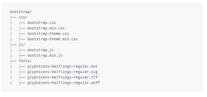
The File Structure
Installing:
Within your HTML page, include Bootstrap's CSS, JS, and the dependency of jQuery (pre version 3, at least as of the latest Bootstrap version). Please note that if you plan to utilize Bootstrap's JavaScript features, your jQuery reference must come before your bootstrap.js reference within your HTML.
You can utilize your installed Bootstrap files from the above section, or reference a CDN provided by the makers of Bootstrap (links taken from Getting Started with Bootstrap):
<!-- Latest compiled and minified CSS -->
<link rel="stylesheet" href="https://maxcdn.bootstrapcdn.com/bootstrap/3.3.7/css/bootstrap.min.css" integrity="sha384-BVYiiSIFeK1dGmJRAkycuHAHRg32OmUcww7on3RYdg4Va+PmSTsz/K68vbdEjh4u" crossorigin="anonymous">

<!-- Optional theme -->
<link rel="stylesheet" href="https://maxcdn.bootstrapcdn.com/bootstrap/3.3.7/css/bootstrap-theme.min.css" integrity="sha384-rHyoN1iRsVXV4nD0JutlnGaslCJuC7uwjduW9SVrLvRYooPp2bWYgmgJQIXwl/Sp" crossorigin="anonymous">

<!-- Latest compiled and minified JavaScript -->
<script src="https://maxcdn.bootstrapcdn.com/bootstrap/3.3.7/js/bootstrap.min.js" integrity="sha384-Tc5IQib027qvyjSMfHjOMaLkfuWVxZxUPnCJA7l2mCWNIpG9mGCD8wGNIcPD7Txa" crossorigin="anonymous"></script>
A very basic Bootstrap webpage:
<!DOCTYPE html>
<html lang="en">
  <head>
    <meta charset="utf-8">
    <meta http-equiv="X-UA-Compatible" content="IE=edge">
    <meta name="viewport" content="width=device-width, initial-scale=1">
    <!-- The above 3 meta tags *must* come first in the head; any other head content must come *after* these tags -->
    <title>Bootstrap 101 Template</title>

    <!-- Bootstrap -->
    <link href="css/bootstrap.min.css" rel="stylesheet">

    <!-- HTML5 shim and Respond.js for IE8 support of HTML5 elements and media queries -->
    <!-- WARNING: Respond.js doesn't work if you view the page via file:// -->
    <!--[if lt IE 9]>
      <script src="https://oss.maxcdn.com/html5shiv/3.7.2/html5shiv.min.js"></script>
      <script src="https://oss.maxcdn.com/respond/1.4.2/respond.min.js"></script>
    <![endif]-->
  </head>
  <body>
    <h1>Hello, world!</h1>

    <!-- jQuery (necessary for Bootstrap's JavaScript plugins) -->
    <script src="https://ajax.googleapis.com/ajax/libs/jquery/1.11.3/jquery.min.js"></script>
    <!-- Include all compiled plugins (below), or include individual files as needed -->
    <script src="js/bootstrap.min.js"></script>
  </body>
</html>
When to use Bootstrap
Bootstrap is an opinionated framework for HTML, CSS and Javascript. It contains basic styling and functionality for what have become accepted [User Interface] elements, such as form elements, buttons, modal windows and navigation elements.
Bootstrap is a responsive web framework, meaning it is designed to adapt layout and design for screen sizes large and small, such as mobile devices, tablets and desktop computers, all in a single code base.
One of the fundamental concepts of Bootstrap is the grid framework. By applying classes to HTML elements, it is possible to create intricate layouts using a basic grid of twelve columns. For example, a four column layout might adapt to two columns on tablet devices and one column on mobile devices. The grid uses media queries , a CSS method for targeting specific screen sizes, to achieve this.
Bootstrap performs particularly well if:
- Custom design is not a top priority
- You are more comfortable editing HTML and adding classes than you are creating custom CSS
- You are comfortable using a framework that will have many visual similarities to many other websites
Bootstrap can be used by those who are new to HTML, CSS and Javascript, since the documentation is excellent. However, there is a learning curve for those not entirely comfortable with the three basic technologies used by Bootstrap (HTML, CSS and Javascript).
It is possible to purchase or download Bootstrap themes in order to alter the style or functionality of Bootstrap. It is also possible to use Bootstrap as a starting point, with customization of CSS and Javascript.