twitter-bootstrap Using Clearfix in Rows and Cols Why Would Bootstrap Columns Exceed 12 in a Row?
Example
There are many responsive scenarios where it's necessary to have column units exceeding 12 in a single .row element. This is known as column wrapping.
If more than 12 columns are placed within a single row, each group of extra columns will, as one unit, wrap onto a new line.
For example, consider a layout where we want...
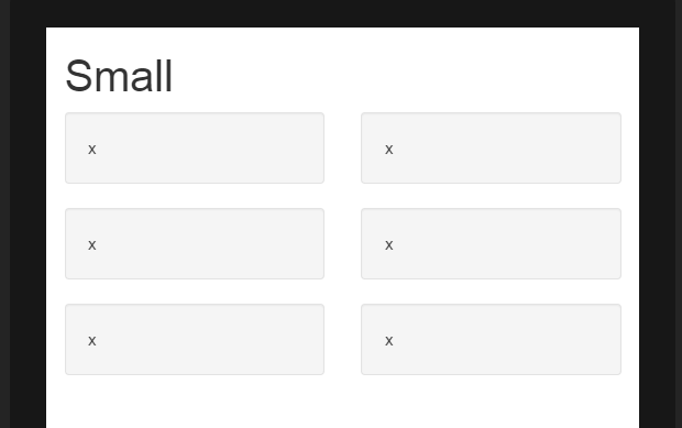
- 3 columns across on large & medium devices, and
- 2 columns across on small & smallest devices


To get this layout in Bootstrap, we'd use (correct)..
<div class="row">
  <div class="col-xs-6 col-md-4"> x </div>
  <div class="col-xs-6 col-md-4"> x </div>
  <div class="col-xs-6 col-md-4"> x </div>
  <div class="col-xs-6 col-md-4"> x </div>
  <div class="col-xs-6 col-md-4"> x </div>
  <div class="col-xs-6 col-md-4"> x </div>
</div>
As you see in the example, the total of column units in the .row element exceeds 12. This technique is known as column wrapping and it’s one of Bootstrap’s most powerful responsive design features. The desired layout would not be possible (other than duplicating markup) if we tried to stick with the common misconception that column units must add up to 12 in a single row.
The layout is not possible when we don't exceed 12 (wrong)..
<div class="row">
  <div class="col-xs-6 col-md-4"> x </div>
  <div class="col-xs-6 col-md-4"> x </div>
</div>
<div class="row">
  <div class="col-xs-6 col-md-4"> x </div>
  <div class="col-xs-6 col-md-4"> x </div>
</div>
<div class="row">
  <div class="col-xs-6 col-md-4"> x </div>
  <div class="col-xs-6 col-md-4"> x </div>
</div>
Wrong method demo (fails 3 columns across on large)
Remember, a .row is not the same as a single line across the viewport. A .row is a grouping of columns. The columns exceeding 12 units in a single .row element will wrap to a new line (down the viewport). That's why is essential to understand that the 12 columns represent horizontal units across the viewport.
Additionally, responsive resets (clearfix) must be used for even wrapping when columns vary in height.
