VB.NET Basic Controls
VB.NET Controls are the pillars that help in creating GUI Based Applications in VB.Net quickly and easily. Windows Forms contains various controls that you can add to forms: controls that display text boxes, buttons, drop-down boxes, radio buttons, and even Web pages.
- Controls are objects that are contained within form objects.
- Each type of control has its own set of properties, methods, and events that make it suitable for a particular purpose.
- You can manipulate controls in the designer and write code to add controls dynamically at run time.
A control is a user interface element used in the VB.Net Form to perform some action. Every control has three features in VB.Net.
- Properties
- Methods
- Events
The following are the most commonly used controls in the VB.Net.
| Control Name | Description |
|---|---|
| Forms | The container for all the controls that make up the user interface. |
| TextBox | Used to give the input and to display the text |
| Label | Used to display the Text |
| Button | Used to perform some action |
| CheckBox | Used to select multiple items from the list |
| RadioButton | Used to select one item from the list |
| DropDownList | Used to select items from the list |
| ListBox | Used to display the list of items at a time |
| Image | Used to display an image |
| ImageButton | Used to display an image and also to perform an action |
| LinkButton | Used to redirect from one page to another page |
| Panel | Used to hold a list of controls |
| CheckBoxList | Used to give multiple items in one control |
| RadioButtonList | Used to give multiple items in one control |
| GridView | Used to display the backend database in the front view |
On the Toolbox pane, you will see all the available controls, and you can easily drag it to the form.
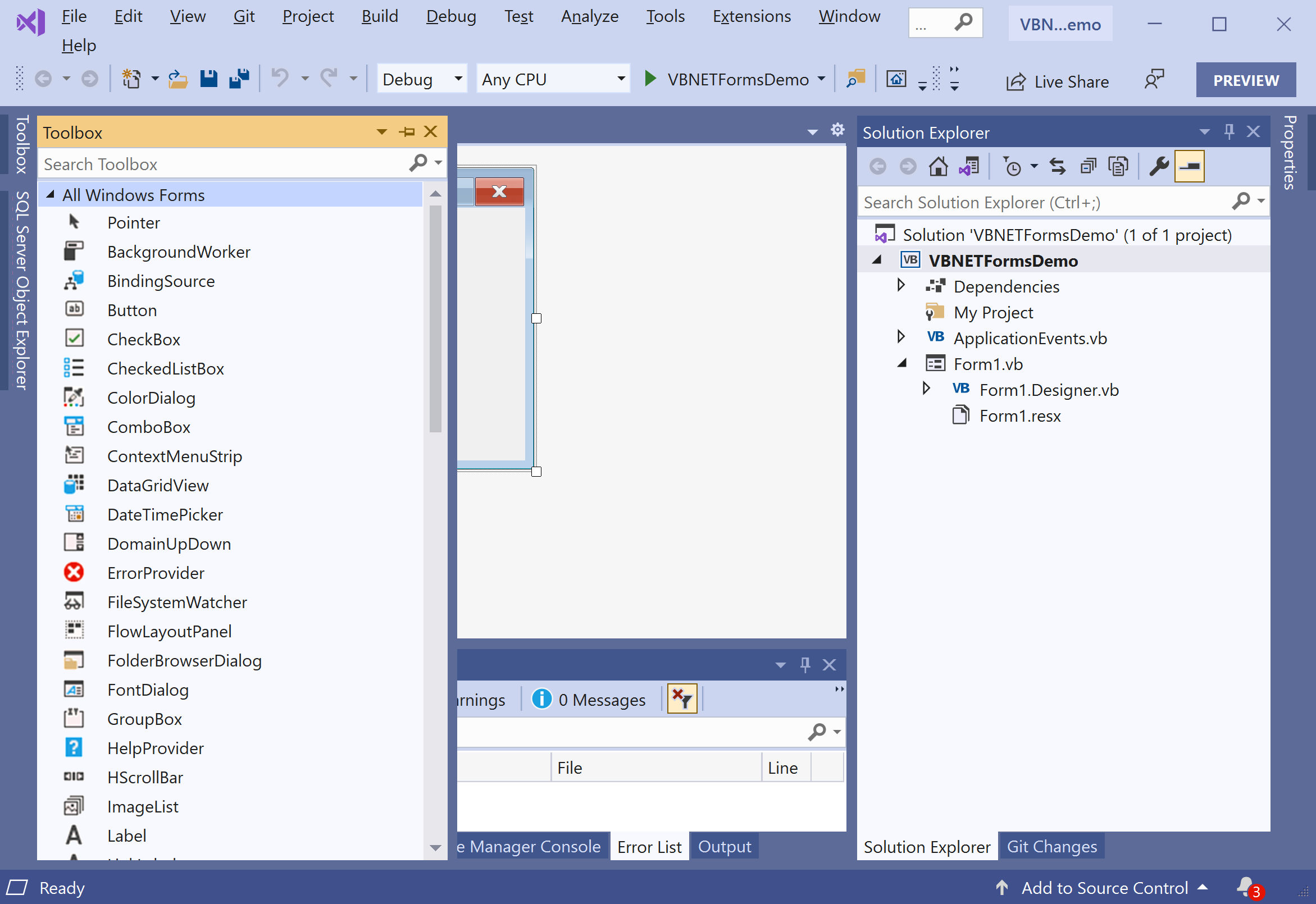
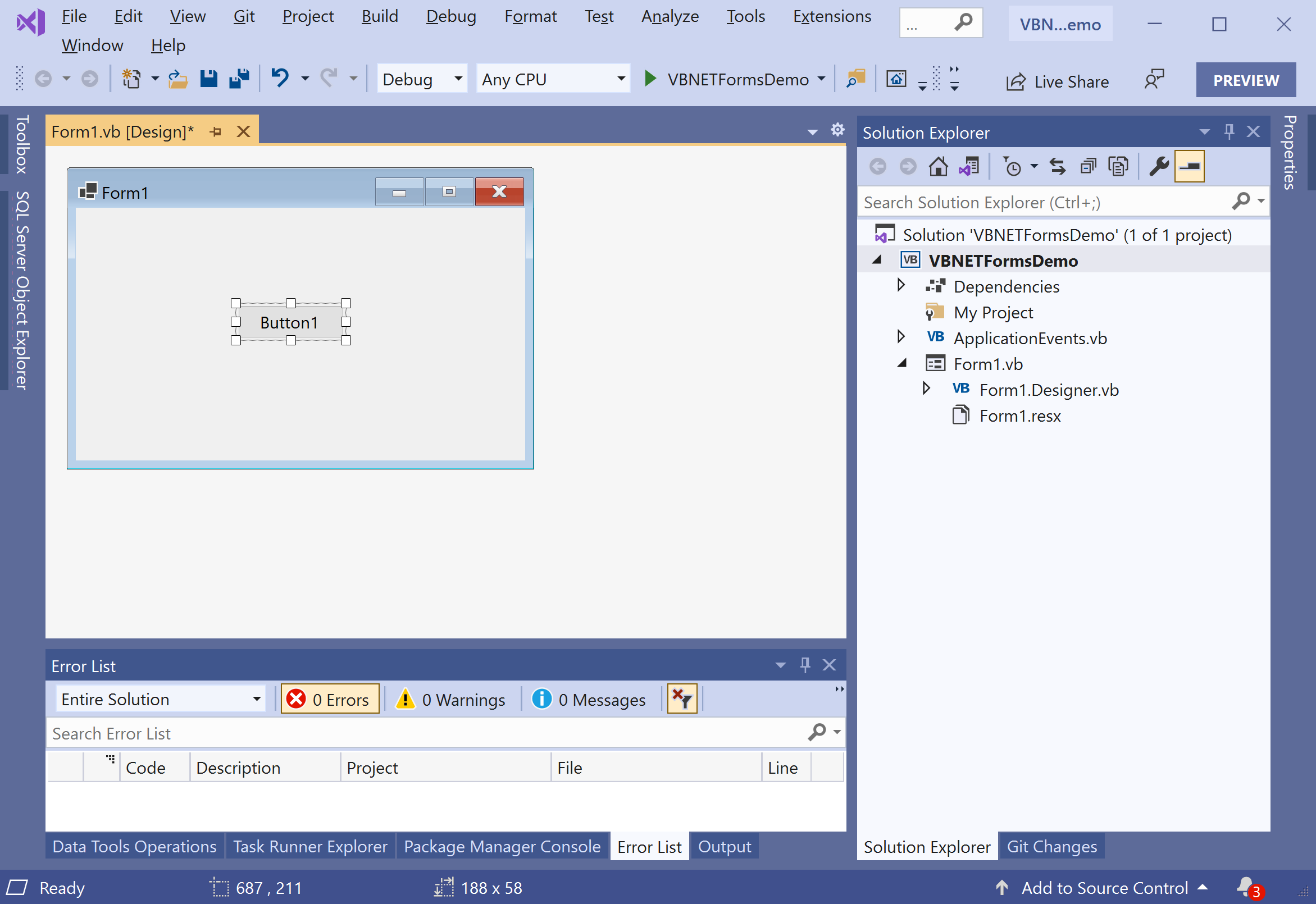
Let's drag a Button control to the form.
Select the Properties from the right-click context menu.
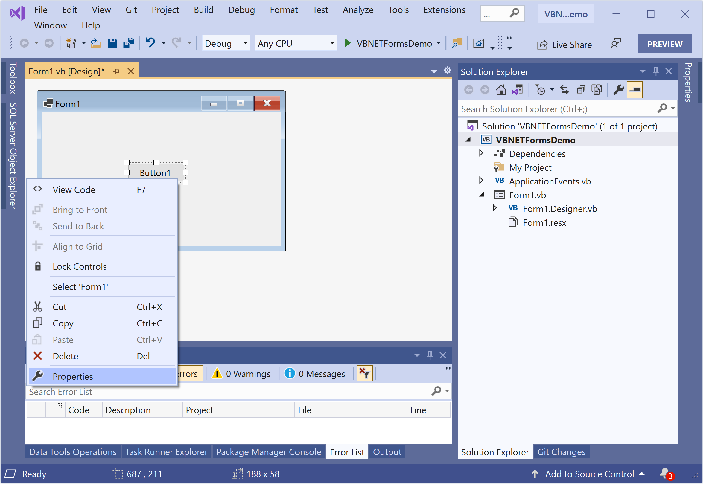
It will open the Properties windows, and you can easily update the properties on the selected control from this window.
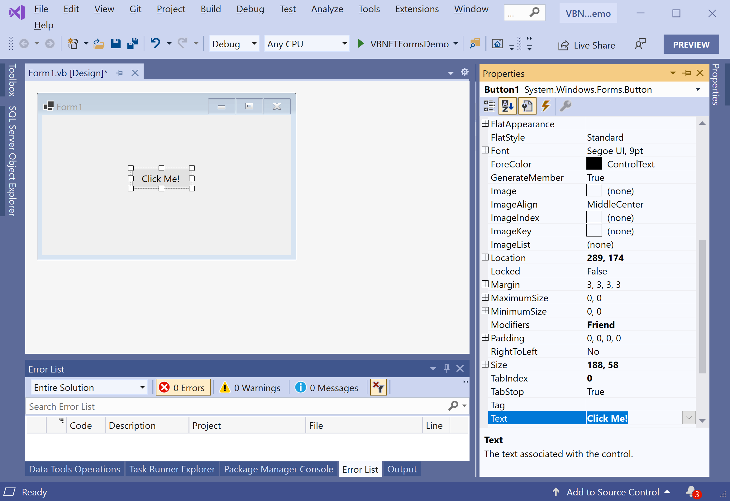
Let's change the Text property of a Button control to Click Me! and you will see that the text of the button is changed. Now to define the click event of a button, double click on the button and it will open the code file containing the event definition.
Button Control Events
The following are the most commonly used events of the Button control.
| Name | Description |
|---|---|
| Click | Occurs when the control is clicked. |
| DoubleClick | Occurs when the user double-clicks the Button control. |
| GotFocus | Occurs when the control receives focus. |
| TabIndexChanged | Occurs when the TabIndex property value changes. |
| TextChanged | Occurs when the Text property value changes. |
| Validated | Occurs when the control is finished validating. |
Button Control Properties
| Name | Description |
|---|---|
| AutoSizeMode | Gets or sets the mode by which the Button automatically resizes itself. |
| BackColor | Gets or sets the background color of the control. |
| BackgroundImage | Gets or sets the background image displayed in the control. |
| DialogResult | Gets or sets a value that is returned to the parent form when the button is clicked. This is used while creating dialog boxes. |
| ForeColor | Gets or sets the foreground color of the control. |
| Image | Gets or sets the image that is displayed on a button control. |
| Location | Gets or sets the coordinates of the upper-left corner of the control relative to the upper-left corner of its container. |
| TabIndex | Gets or sets the tab order of the control within its container. |
| Text | Gets or sets the text associated with this control. |
Button Control Methods
The following are the most commonly used methods of the Button control.
| Name | Description |
|---|---|
| GetPreferredSize | Retrieves the size of a rectangular area into which a control can be fitted. |
| NotifyDefault | Notifies the Button whether it is the default button so that it can adjust its appearance accordingly. |
| Select | Activates the control. |
| ToString | Returns a String containing the name of the Component, if any. This method should not be overridden. |
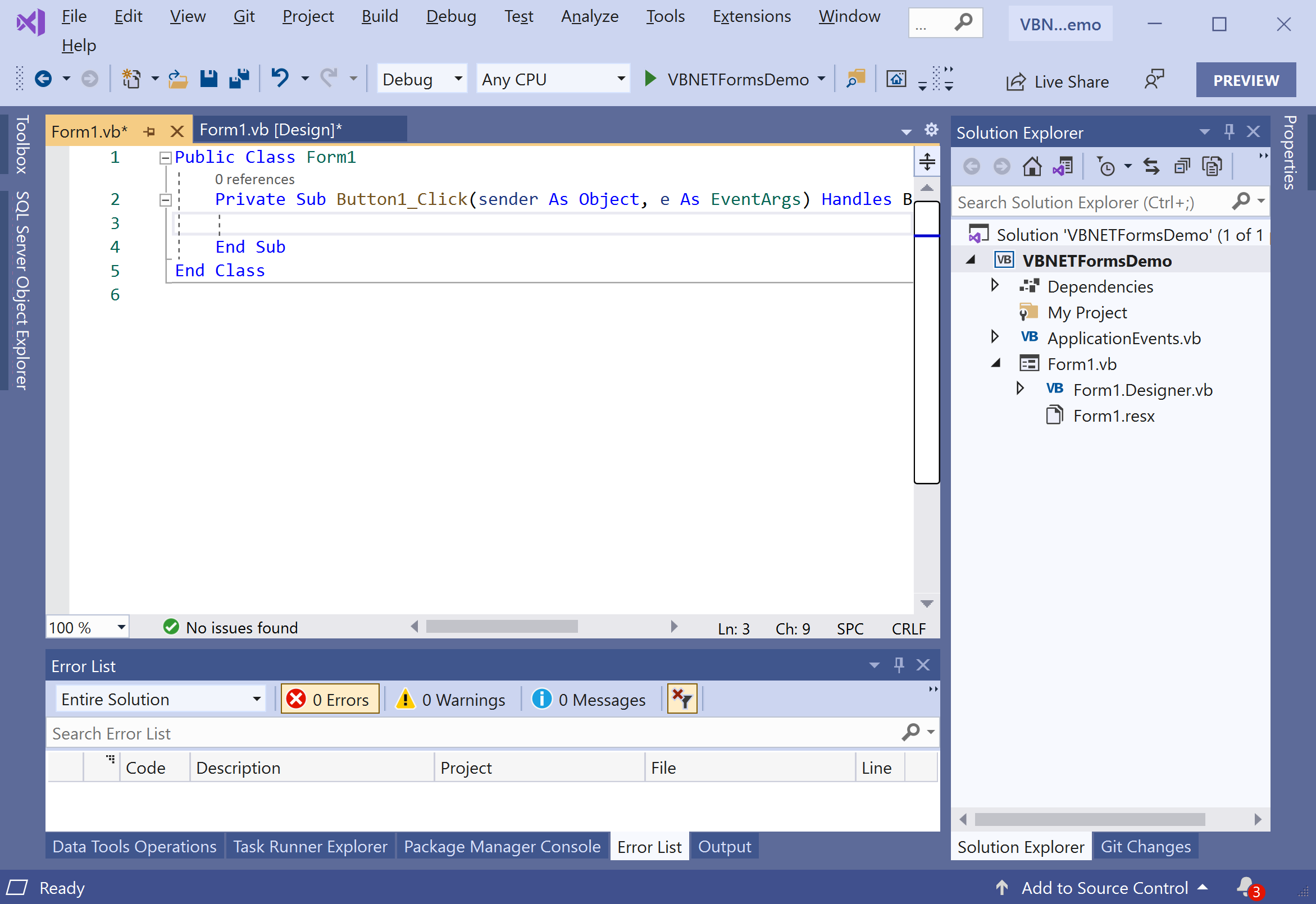
Let's add the following code, which will display a message when you click the button.
Public Class Form1
    Private Sub Button1_Click(sender As Object, e As EventArgs) Handles Button1.Click
        MessageBox.Show("You clicked the button.")
    End Sub
End Class
Let's run your application, and you will see the following dialog.
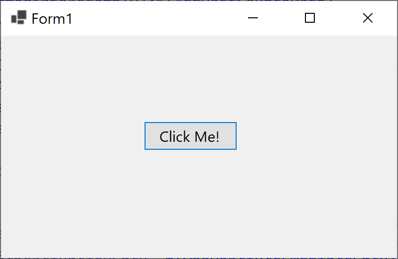
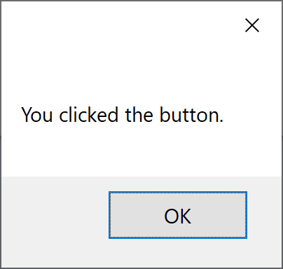
Now click the button, and you will see the following message.
