IOS Create iOS UI with Auto Layout
When you create your iOS application, it must be able to run on many different devices. The iOS 11 operating system runs on the iPhone 5S and later, various iPad Airs, iPad minis, iPad Pros, and even the sixth-generation iPod Touch.
- So we have multiple different physical screen sizes and different resolutions
- It is not the same layout, only larger or smaller screen sizes, but the aspect ratio of height to width is also completely different.
- You can also be switched from portrait to landscape, and someone can change the settings on their device, and they want a larger font.
Auto Layout
- We need a user interface that can automatically adjust itself for multiple devices and orientations.
- It should be flexible and adaptive so that it can adapt itself to different circumstances.
- We can achieve that by using Auto Layout feature, it is not some additional option that we have to enable, it is already in there, and we need to know how to use it.
So let's create a new project and it AdaptiveUIDemo and go to the storyboard file. You can change the current device perspective at the bottom.
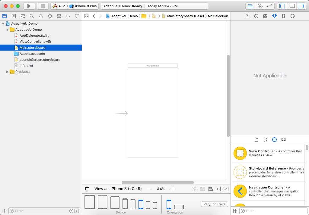
- You can change the orientation between portrait and landscape.
- You have different device options as well, like several iPad sizes, a Plus size iPhone, iPhone X, iPhone SE, and all the way down to the smallest option of an iPhone 4S.
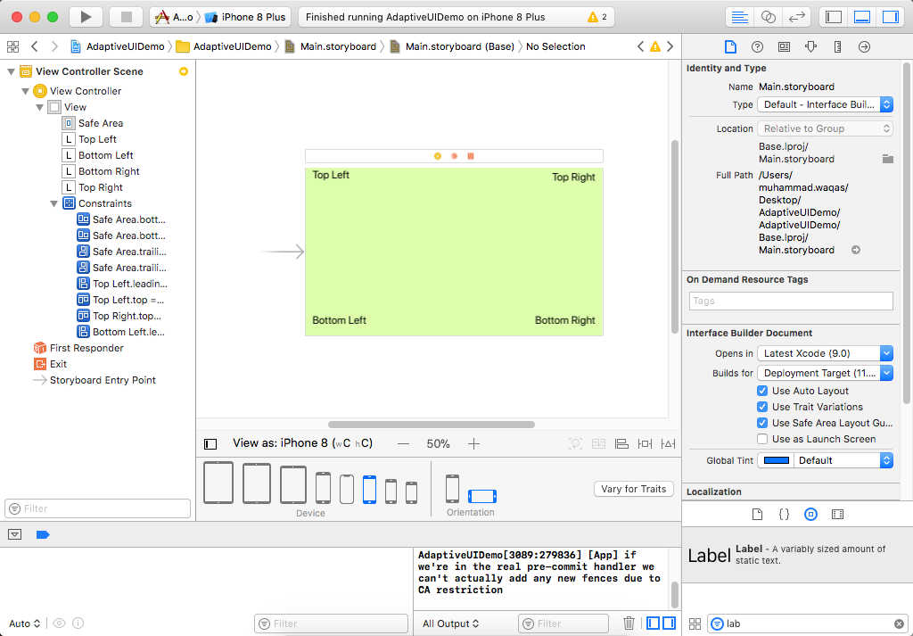
In Xcode, by default, you are initially shown the ViewController roughly as it would look viewed on an iPhone 8 in portrait mode. We have added several labels them at all four corners.
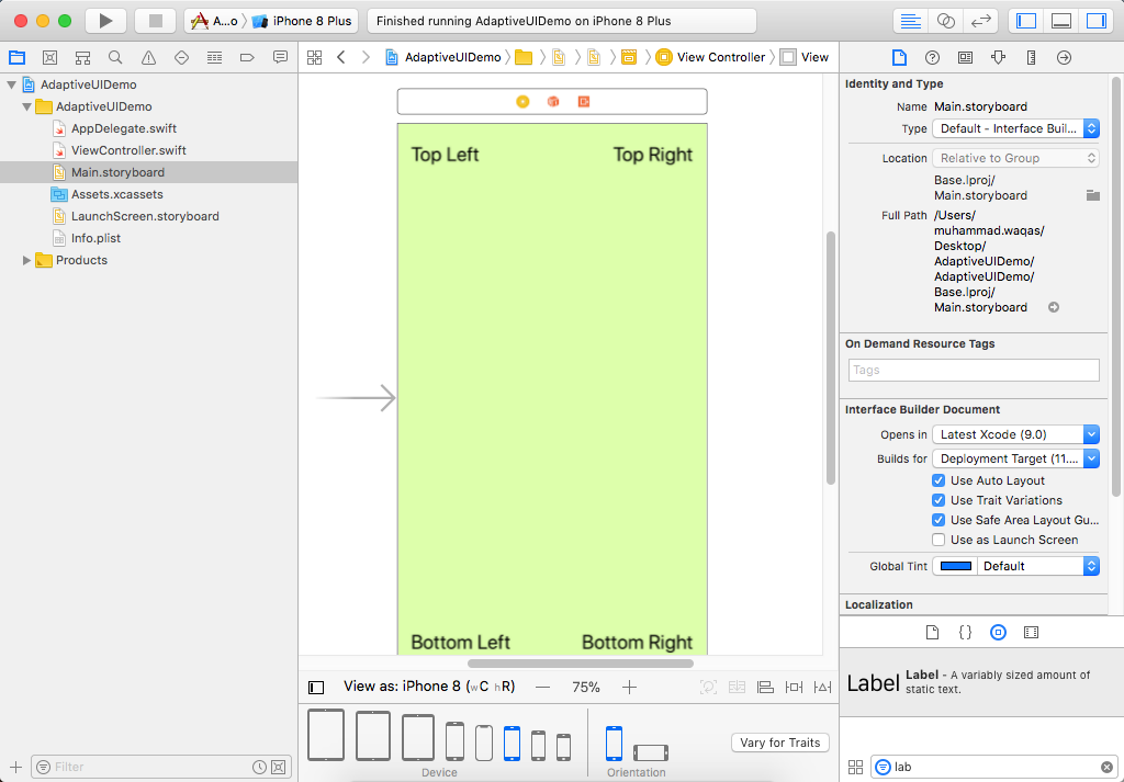
At the bottom of the storyboard, you can see that we are viewing it an iPhone 8, and in the Xcode toolbar, we have chosen to run on the iPhone 8 Plus simulator.
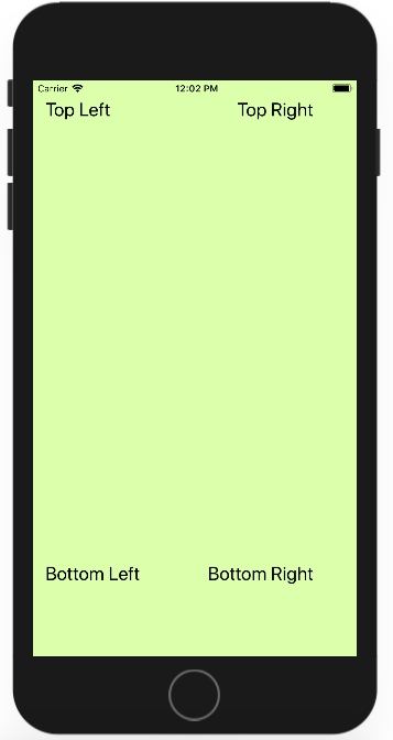
You can see some blank space at the bottom because the iPhone 8 Plus has a larger screen than the iPhone 8. Let's switch the simulator to landscape mode.
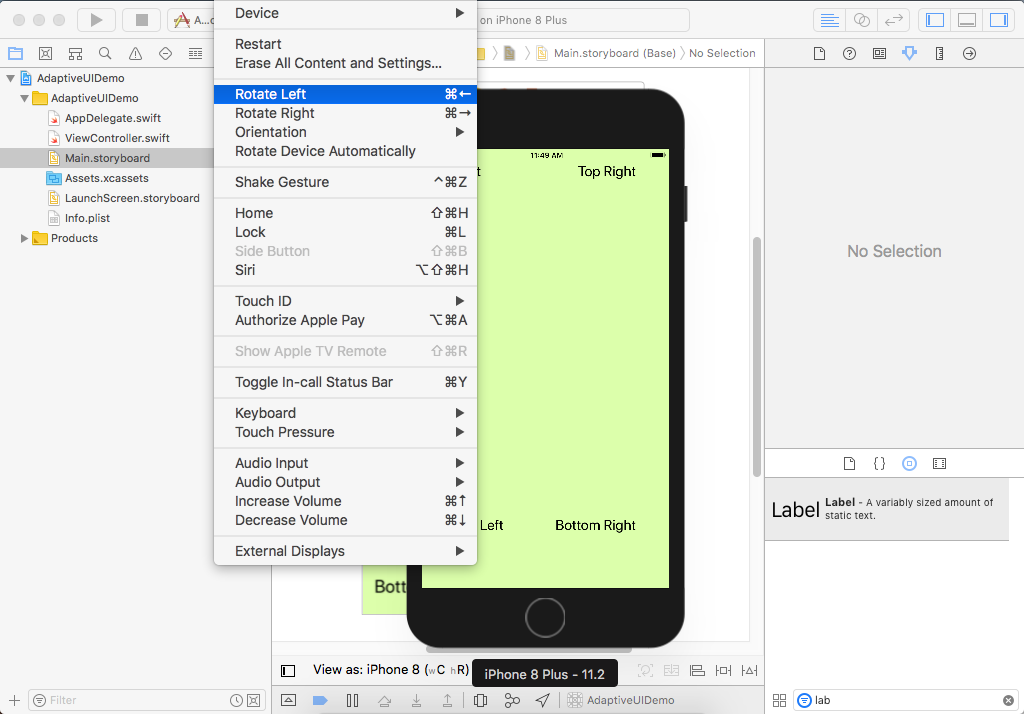
Go to the Hardware menu, and select Rotate Left or Rotate Right.
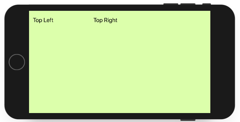
You can see that this is even worse because we are unable to see some content on the bottom of our user interface.
Adding and Editing Auto Layout Constraints
When you make a new Xcode project, Auto Layout is already turned on. In the storyboard, go to the first inspector, i.e., the File Inspector.
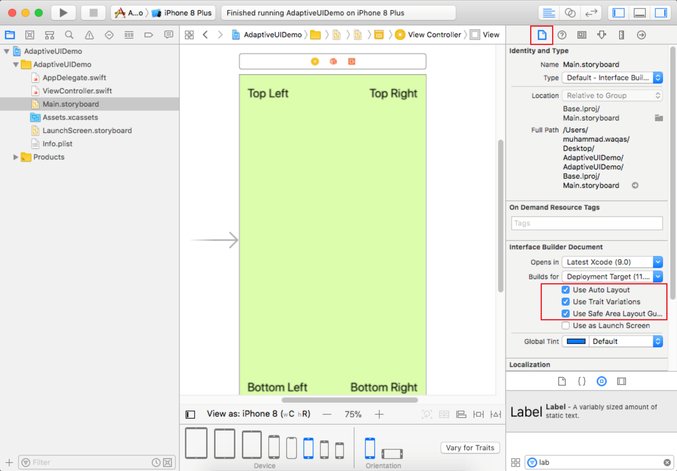
You can see that Use Auto Layout is checked, there are a couple of other associated options also checked. One is this Safe Area; it is that part of the user interface that won't be obscured by something else.
- So Auto Layout is on, and it does everything based on constraints.
- If you don't add your own constraints, Xcode will generate some for you at runtime.
- But unfortunately, Xcode will add constraints that will orient and lock everything to the top left, and that's why things will look a little inflexible when you don't add your own.
Let's go to our demo project, and you can see that on top right corner we have positioned the label using an iPhone 8 view. But you want to change it to a narrower screen like an iPhone SE.
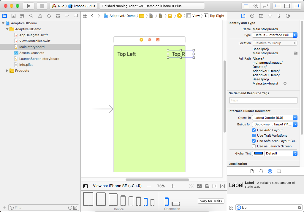
Now you won't see most of the button because it's default position is to a certain distance from the top left corner. So here we need the button to orient itself to the top right corner, but not to the top left. So we will define two constraints here;
- The space between the right side of the label and the right edge of the Safe Area.
- The space between the top side of the label and the top edge of the Safe Area.
To do so, hold the control key, click the label and drag to the right side of view.
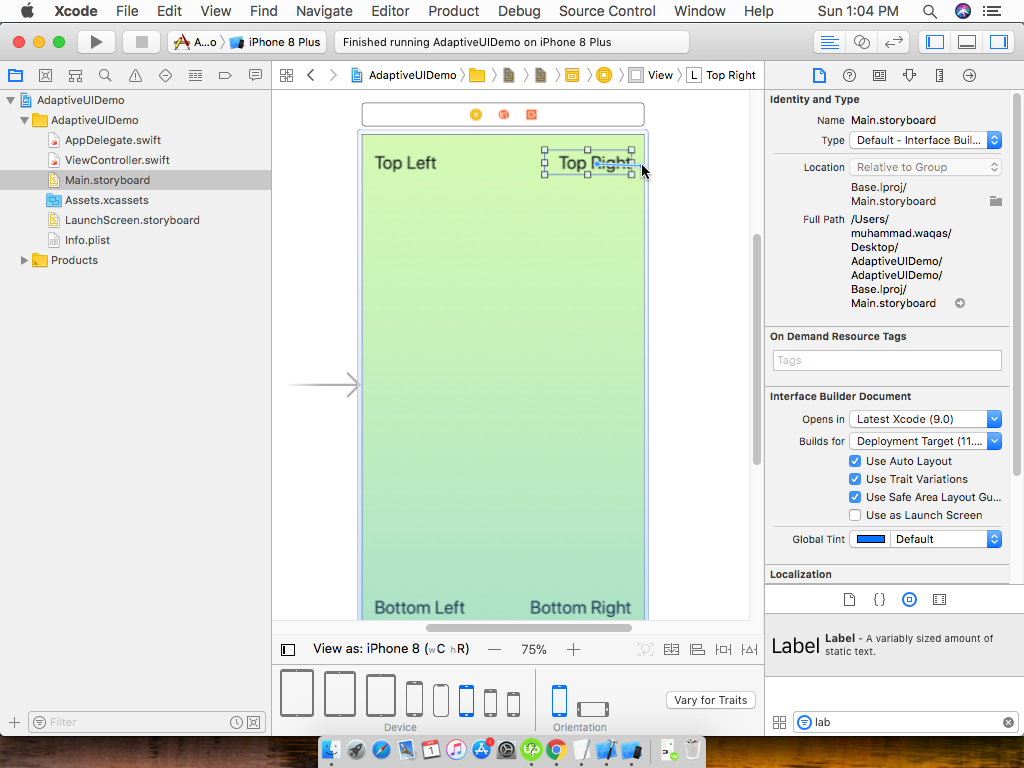
When you leave the mouse button, you will see a small pop-up with multiple options.
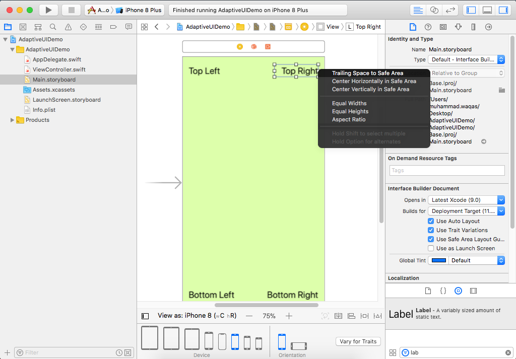
Click on the first one, which is Trailing Space to Safe Area.
-We have added our first manual constraint for the top right label, Xcode is no longer generating any constraints for that label. -Now the problem is that we have to change the horizontal position of the label, but it doesn't know what to do with the vertical position if the screen was to get shorter or taller.
So we need one more constraint, hold the control key, click the label and drag up.
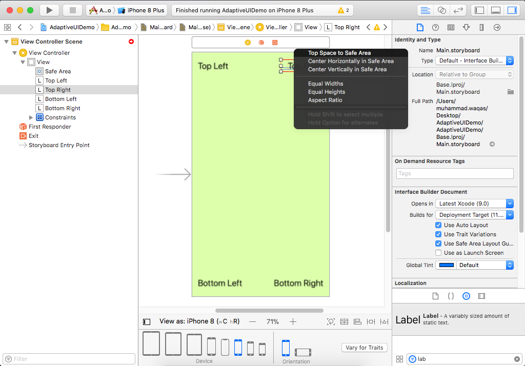
Select the constraint that is the Top Space to the Safe Area. Now let's change iPhone 8 view to an iPhone 8 Plus.
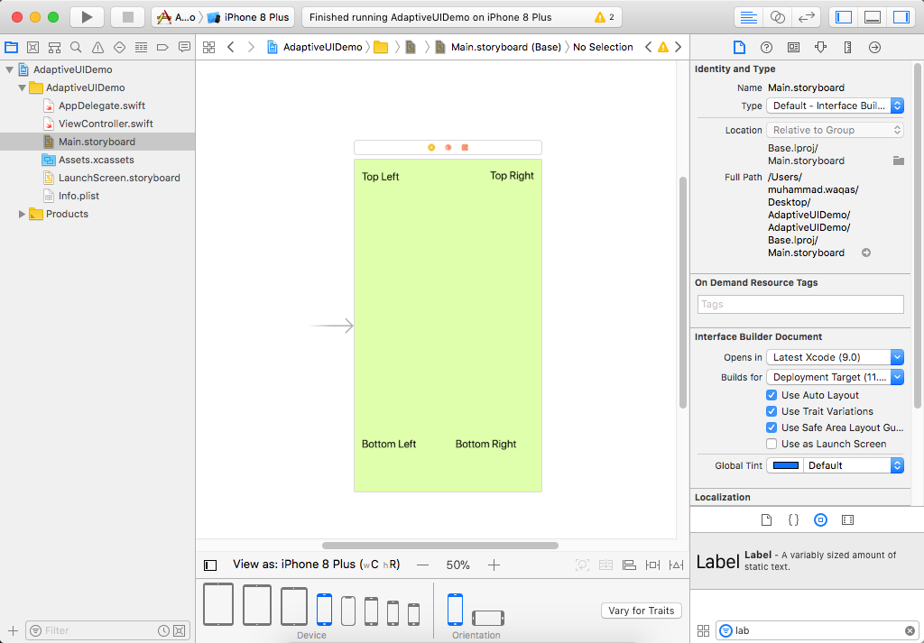
You can see the top right label has moved out to the right, whereas the bottom right label hasn't changed its position. Let's back to that iPhone SE.
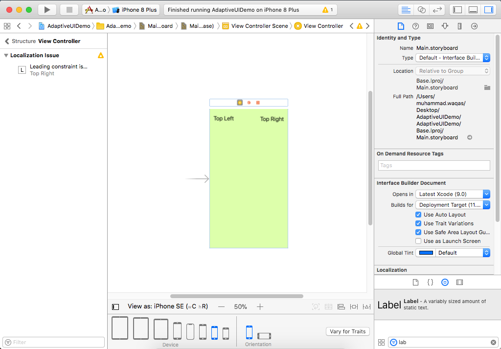
You can see the top right label now, but the bottom labels are not visible. When you turn an iPhone to landscape mode, iOS turns off the top status bar with the battery and the time.
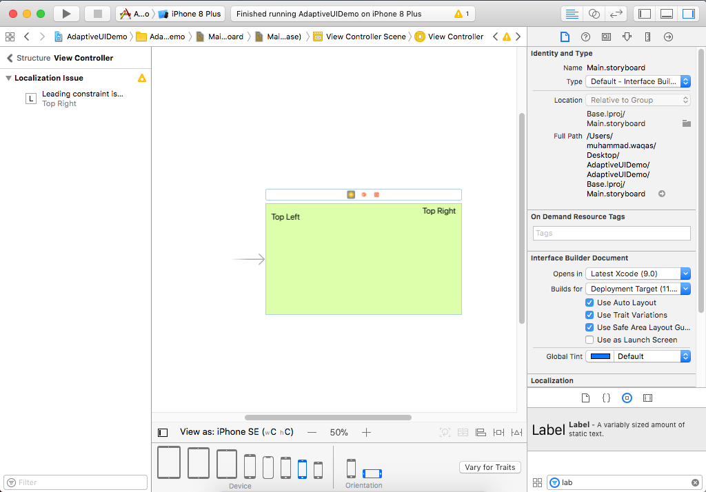
It means that in landscape mode, the Safe Area goes to the top of the screen that's why the top labels are not aligned. So let's define the constraints of other labels as well with their corresponding sides of the view.
