IOS
- Getting started with iOS
- Learn Tutorial
- Overview
- Xcode Basics
- Create iOS Project
- Add UI Elements
- Views Hierarchy
- UIKit
- Define Views
- Access Subviews
- Action & Outlet
- Create iOS App with Multiple Views
- Add Navigation Controller
- How to Configure Table View
- Add iOS Table View and Data Source
- Sections & Headings
- Table View Delegate Behavior
- Custom Table View Cell
- Create iOS UI with Auto Layout
- Create Flexible Layouts with Stack Views
- Adaptive UI Using Traits and Size Classes
- Create a Tabbed Application
- Add a Toolbar
- Add Swipe Actions
- Add an Alert
- Images & Application Icon
- Launch Screen
- 3D Touch
- Accessibility
- ADDING A SWIFT BRIDGING HEADER
- AFNetworking
- AirDrop
- AirPrint tutorial in iOS
- Alamofire
- App Submission Process
- App Transport Security (ATS)
- App wide operations
- AppDelegate
- Application rating/review request
- ARC (Automatic Reference Counting)
- attributedText in UILabel
- Auto Layout
- AVPlayer and AVPlayerViewController
- AVSpeechSynthesizer
- AWS SDK
- Background Modes
- Background Modes and Events
- Basic text file I/O
- Block
- CAAnimation
- Cache online images
- CAGradientLayer
- CALayer
- Carthage iOS Setup
- CAShapeLayer
- Categories
- CGContext Reference
- Chain Blocks in a Queue (with MKBlockQueue)
- Change Status Bar Color
- Checking for Network Connectivity
- Checking iOS version
- CLLocation
- CloudKit
- Codable
- Code signing
- Concurrency
- Configure Beacons with CoreBluetooth
- Contacts Framework
- Content Hugging/Content Compression in Autolayout
- Convert HTML to NSAttributed string and vice verse
- Convert NSAttributedString to UIImage
- Core Data
- Core Graphics
- Core Location
- Core Motion
- Core SpotLight in iOS
- CoreImage Filters
- Create .ipa File to upload on appstore with Applicationloader
- Create a Custom framework in iOS
- Create a video from images
- Creating an App ID
- CTCallCenter
- Custom fonts
- Custom Keyboard
- Custom methods of selection of UITableViewCells
- Custom methods of selection of UITableViewCells
- Custom UITextField
- Custom UIViews from XIB files
- Cut a UIImage into a circle
- CydiaSubstrate tweak
- Debugging Crashes
- Deep Linking in iOS
- DispatchGroup
- Dynamic Type
- Dynamically updating a UIStackView
- EventKit
- Extension for rich Push Notification - iOS 10.
- Face Detection Using CoreImage/OpenCV
- FacebookSDK
- Fastlane
- FCM Messaging in Swift
- FileHandle
- GameCenter Leaderboards
- GameplayKit
- GCD (Grand Central Dispatch)
- Graph (Coreplot)
- Guideline to choose best iOS Architecture Patterns
- Handle Multiple Environment using Macro
- Handling URL Schemes
- Healthkit
- iBeacon
- IBOutlets
- In-App Purchase
- Initialization idioms
- iOS - Implementation of XMPP with Robbie Hanson framework
- iOS 10 Speech Recognition API
- iOS Google Places API
- iOS TTS
- Key Value Coding-Key Value Observation
- Keychain
- Load images async
- Localization
- Make selective UIView corners rounded
- Managing the Keyboard
- MKDistanceFormatter
- MKMapView
- ModelPresentationStyles
- MPMediaPickerDelegate
- MPVolumeView
- Multicast Delegates
- MVP Architecture
- MVVM
- MyLayout
- Navigation Bar
- NSArray
- NSAttributedString
- NSBundle
- NSData
- NSDate
- NSHTTPCookieStorage
- NSInvocation
- NSNotificationCenter
- NSPredicate
- NSTimer
- NSURL
- NSURLConnection
- NSURLSession
- NSUserActivity
- NSUserDefaults
- Objective-C Associated Objects
- OpenGL
- Passing Data between View Controllers
- Passing Data between View Controllers (with MessageBox-Concept)
- PDF Creation in iOS
- plist iOS
- Profile with Instruments
- Push Notifications
- QR Code Scanner
- Realm
- Resizing UIImage
- Rich Notifications
- Runtime in Objective-C
- Safari Services
- Security
- Segues
- Set View Background
- Simulating Location Using GPX files iOS
- Simulator
- Simulator Builds
- SiriKit
- Size Classes and Adaptivity
- Size Classes and Adaptivity
- SLComposeViewController
- Snapshot of UIView
- SqlCipher integration
- StoreKit
- Storyboard
- Swift and Objective-C interoperability
- Swift: Changing the rootViewController in AppDelegate to present main or login/onboarding flow
- SWRevealViewController
- UI Testing
- UIActivityViewController
- UIAlertController
- UIAppearance
- UIBarButtonItem
- UIBezierPath
- UIButton
- UICollectionView
- UIColor
- UIControl - Event Handling with Blocks
- UIDatePicker
- UIDevice
- UIFeedbackGenerator
- UIFont
- UIGestureRecognizer
- UIImage
- UIImagePickerController
- UIImageView
- UIKit Dynamics
- UIKit Dynamics with UICollectionView
- UILabel
- UILabel text underlining
- UILocalNotification
- UINavigationController
- UIPageViewController
- UIPheonix - easy, flexible, dynamic & highly scalable UI framework
- UIPickerView
- UIRefreshControl TableView
- UIScrollView
- UIScrollView AutoLayout
- UIScrollView with StackView child
- UISearchController
- UISegmentedControl
- UISlider
- UISplitViewController
- UISplitViewController
- UIStackView
- UIStoryboard
- UISwitch
- UITabBarController
- UITableView
- UITableViewCell
- UITableViewController
- UITextField
- UITextField Delegate
- UITextView
- UIView
- UIViewController
- UIWebView
- Universal Links
- Using Image Aseets
- UUID (Universally Unique Identifier)
- WCSessionDelegate
- WKWebView
- Xcode Build & Archive From Command Line
- XCTest framework - Unit Testing
IOS Create Flexible Layouts with Stack Views
Stack Views
Stack views let you leverage the power of Auto Layout, creating user interfaces that can dynamically adapt to the device's orientation, screen size, and any changes in the available space.
- A stack view takes two or more view objects and then stacks them either horizontally or vertically.
- The stack view manages the layout of all the views in its arranged Subviews property.
Adding Stack Views
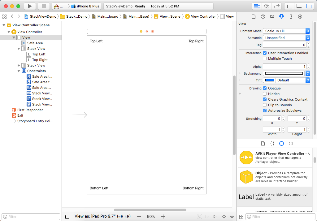
So, let's create a new Single View App and call it StackLayoutDemo and add four labels on each corner.
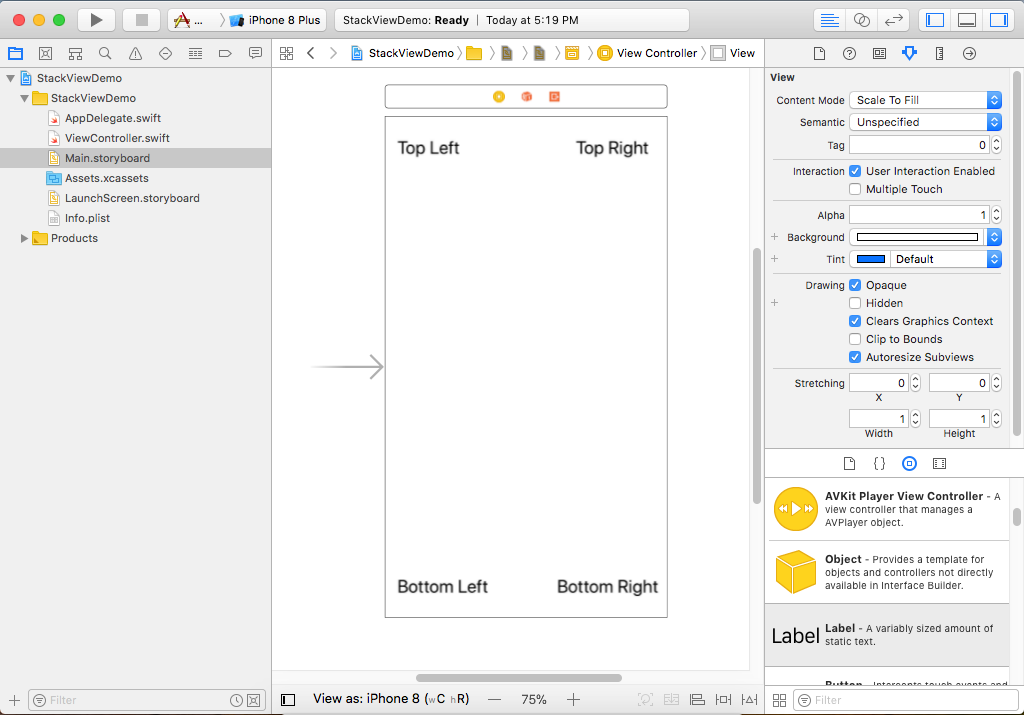
Previously, we fixed this problem using Auto Layout constraints, so now we will fix it with stack views. Now first we want to take the top two controls across the top and put them in a stack view. Select the Top Left and Top Right labels.
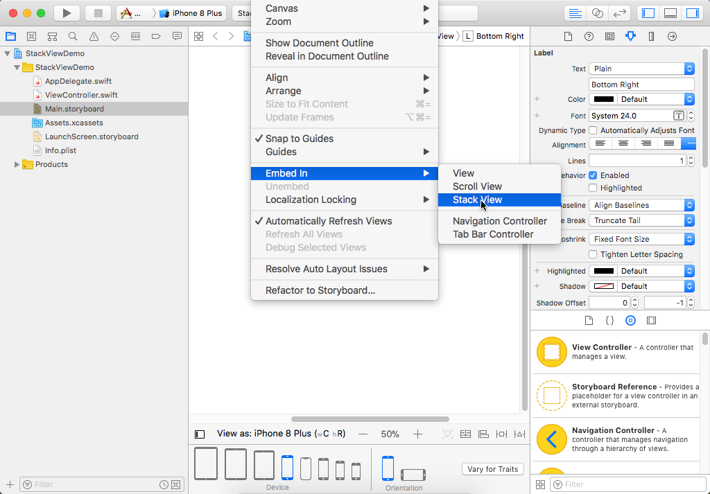
Choose Editor > Embed In > Stack View menu option. Now you can see in the Document Outline that the top two labels are now inside a stack view, but both labels are next to each other.
We want this stack view to span the available width of whatever device and whatever orientation we are running on, and this is where setting up Auto Layout constraints is still essential.
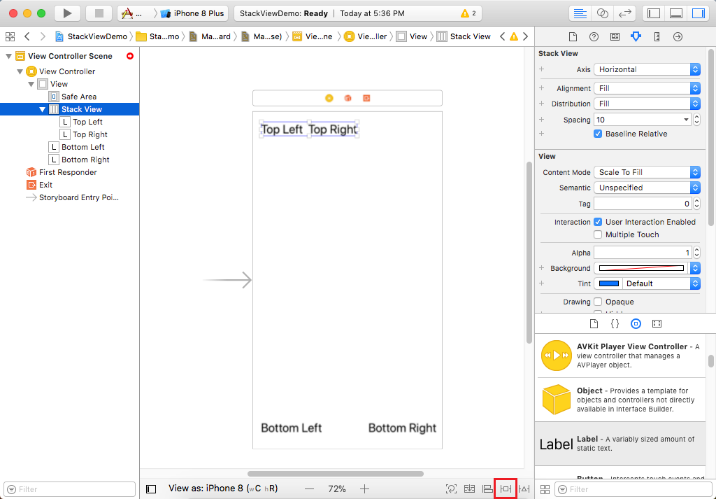
The best option for adding constraints for a stack view is using the Add New Constraints option at the bottom of the storyboard which is highlighted in above image.
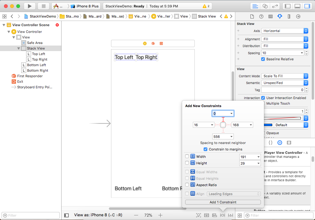
Let's add manual constraints by clicking the red dotted line to the top, left and right, which is going to connect it to the Safe Area, 16 points from the left, and 16 points from the right.
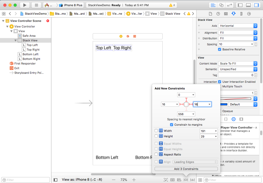
Click Add 3 Constraint button, and now they don't seem to be laid out very attractively, and that's to do with the distribution that's happening within this stack view. Go to the Attributes Inspector.
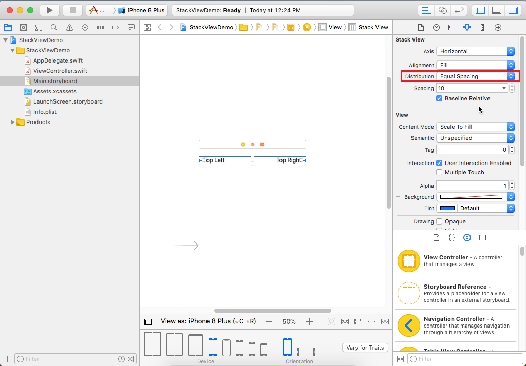
In the Distribution drop-down, select Equal Spacing. Now repeat the same steps for bottom labels as well by adding manual constraints.
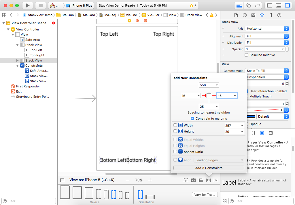
Again in Attributes Inspector, select the Equal Spacing option in Distribution dropdown list. If you change to landscape mode, we have a more available width, so the stack views expand, and the views inside them are distributed out, and it just works.
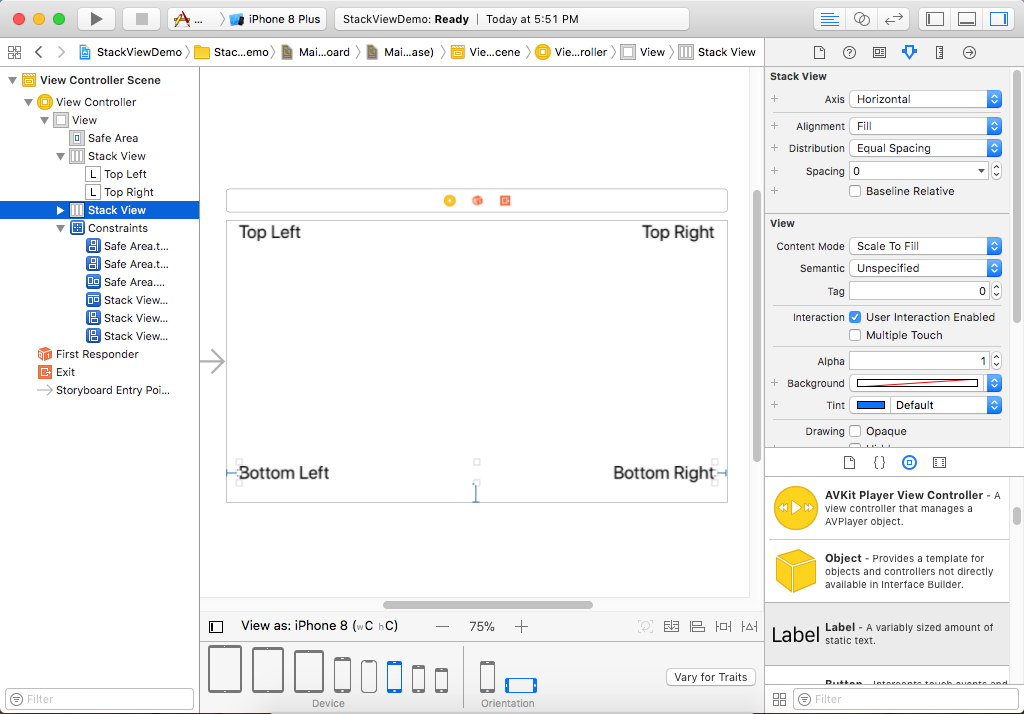
Similarly, if you change the view to iPad Pro, you will see the same view.
